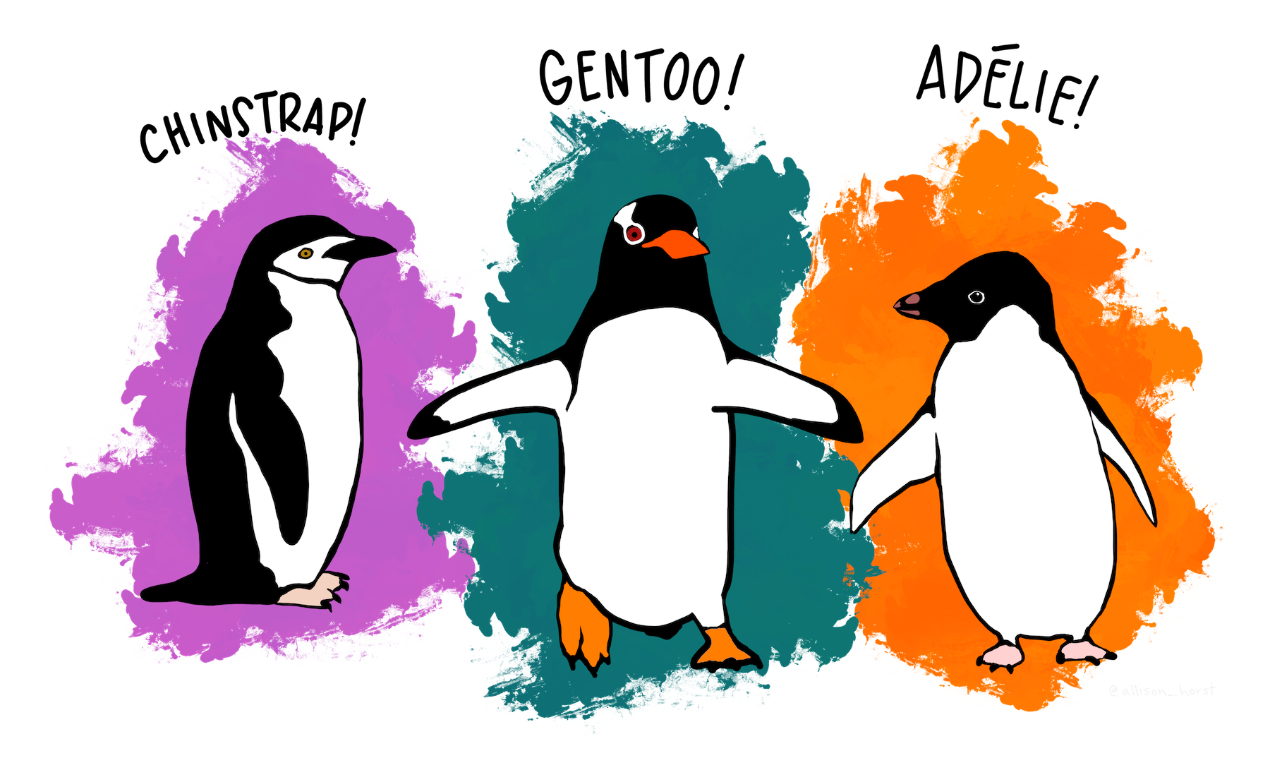
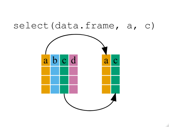
Image 1 of 1: ‘Diagram illustrating use of select function to select two columns of a data frame’
Figure 3
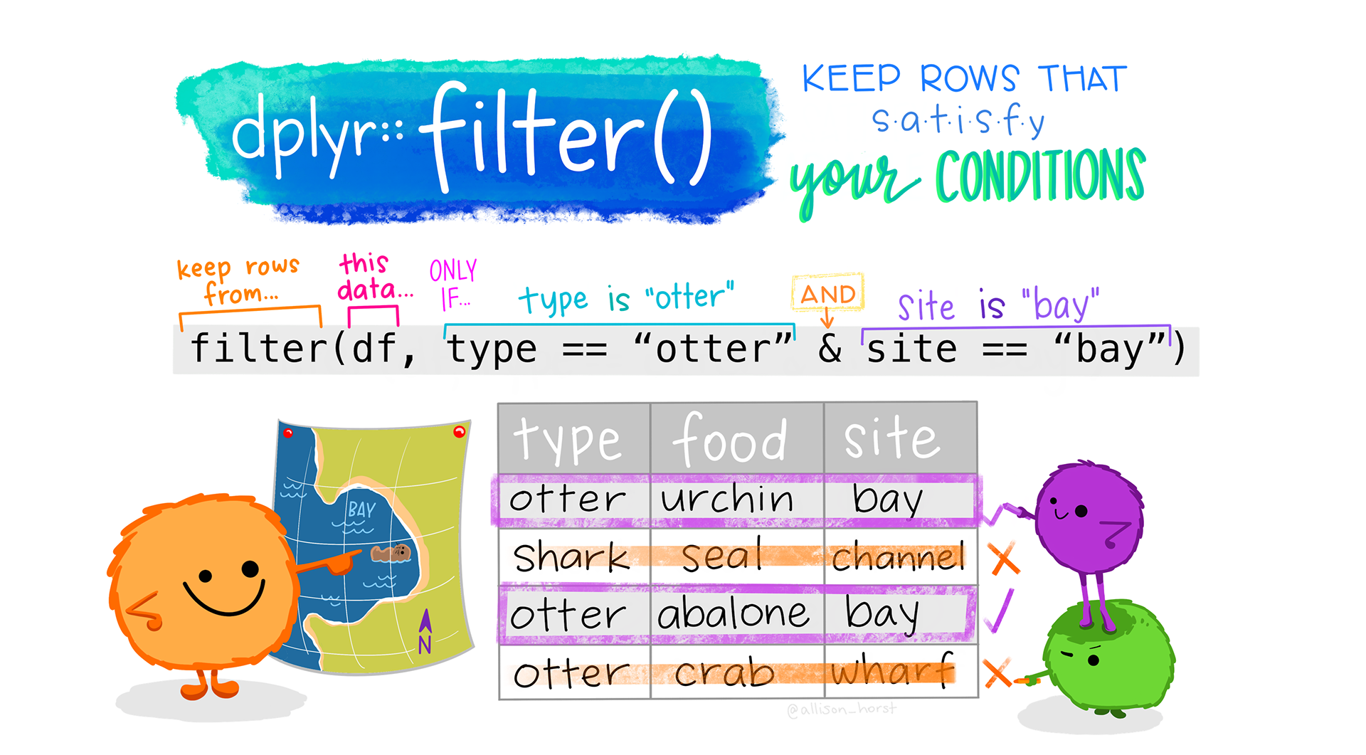
Image 1 of 1: ‘Cartoon showing three fuzzy monsters either selecting or crossing out rows of a data table. If the type of animal in the table is “otter” and the site is “bay”, a monster is drawing a purple rectangle around the row. If those conditions are not met, another monster is putting a line through the column indicating it will be excluded. Stylized text reads "dplyr::filter() - keep rows that satisfy your conditions."’
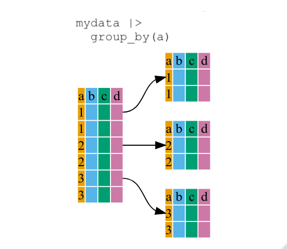
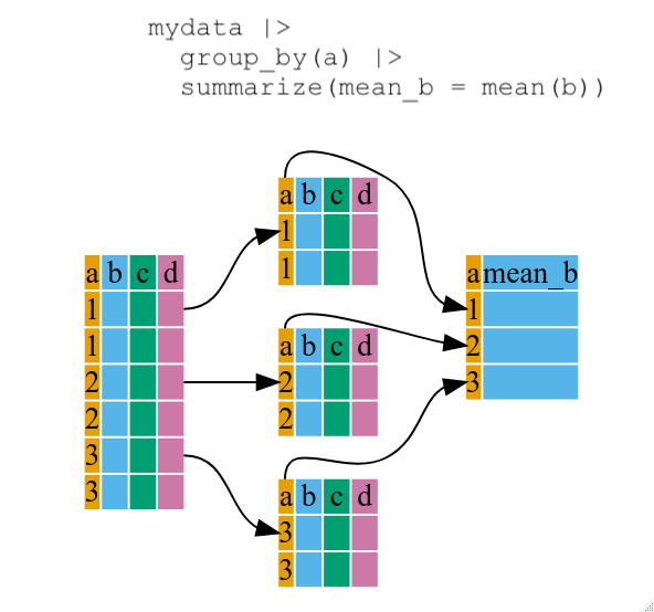
Image 1 of 1: ‘Diagram illustrating how the group by function oraganizes a data frame into groups’
Figure 5
Image 1 of 1: ‘Diagram illustrating the use of group by and summarize together to create a new variable’
Figure 6
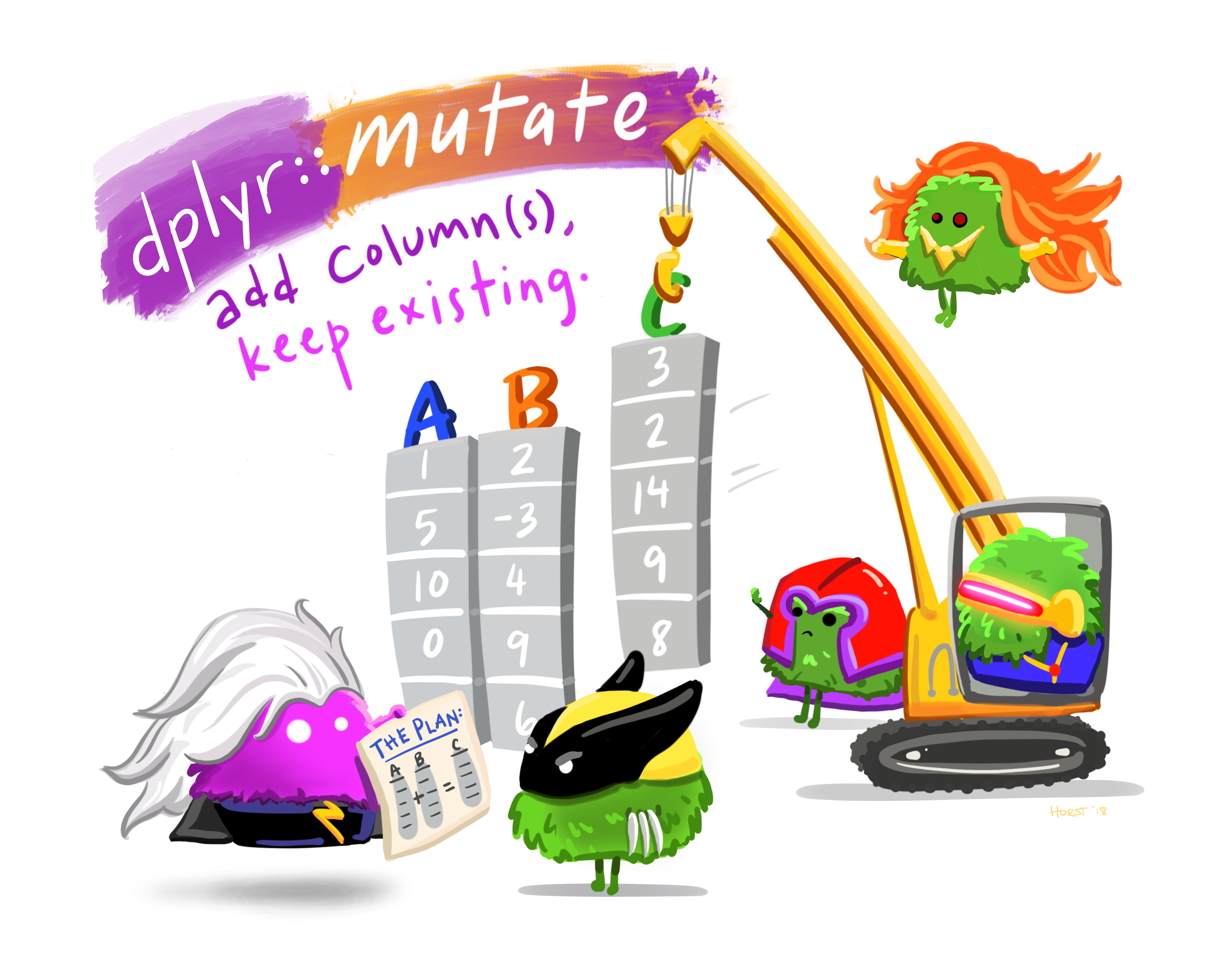
Image 1 of 1: ‘Cartoon of cute fuzzy monsters dressed up as different X-men characters, working together to add a new column to an existing data frame. Stylized title text reads "dplyr::mutate - add columns, keep existing."’
Image 1 of 1: ‘Blank plot, before adding any mapping aesthetics to ggplot().’
Figure 2
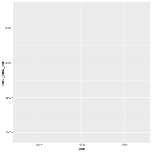
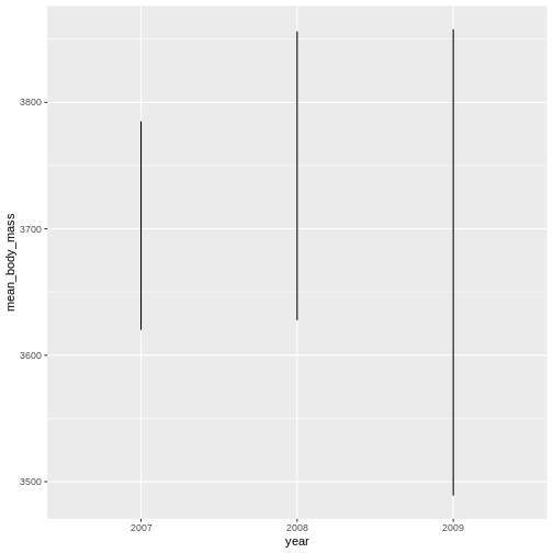
Image 1 of 1: ‘Plotting area with axes for a scatter plot of mean body mass vs year, with no data points visible.’
Figure 3
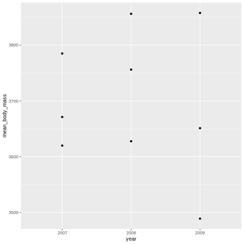
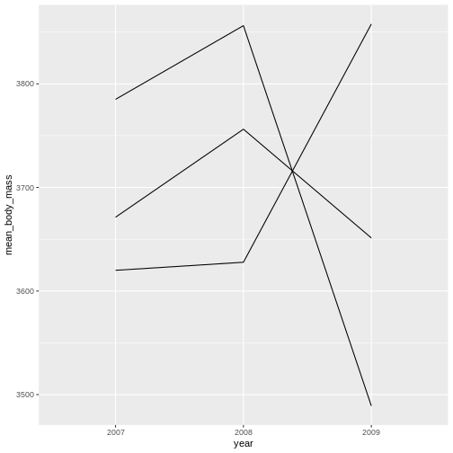
Image 1 of 1: ‘Scatter plot of mean body mass vs year, now showing the data points.’
Figure 4
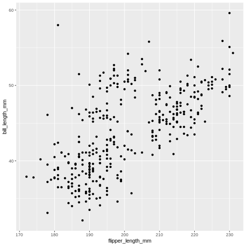
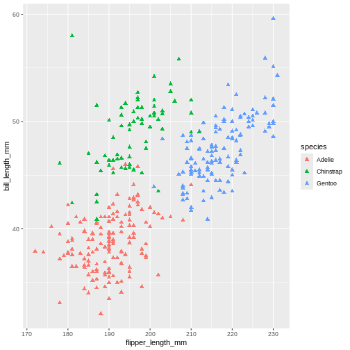
Image 1 of 1: ‘Scatter plot showing bill length (mm) versus flipper length (mm) for individual penguins, displaying each species as distinct points. All points are coloured on the plot are coloured black.’
Scatter plot showing bill length (mm) versus flipper length (mm) for
individual penguins, displaying each species as distinct points. All
points are coloured on the plot are coloured black.
Figure 5
Image 1 of 1: ‘Scatter plot of body mass (g) vs flipper length (mm), with points color-coded by penguin species to show how body mass varies by species and flipper length, thus showing the value of 'aes' function’
Scatter plot of body mass (g) vs flipper length (mm), with points
color-coded by penguin species to show how body mass varies by species
and flipper length, thus showing the value of ‘aes’ function
Figure 6
Figure 7
Figure 8
Figure 9
Figure 10
Figure 11
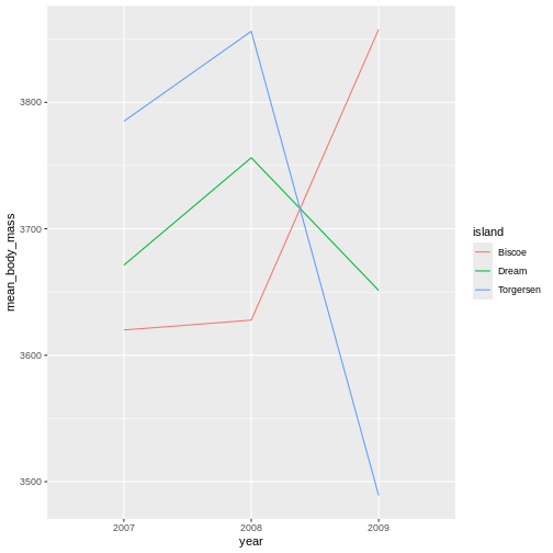
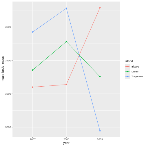
Image 1 of 1: ‘Scatter plot of mran body mass (g) over time, with lines connecting values for each year and species, demonstrating species-specific trends in body mass across years’
Figure 12
Figure 13
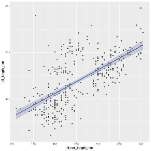
Image 1 of 1: ‘Scatter plot of flipperer length vs bill length with a blue trend line summarising the relationship between variables, and gray shaded area indicating 95% confidence intervals for that trend line.’
Figure 14
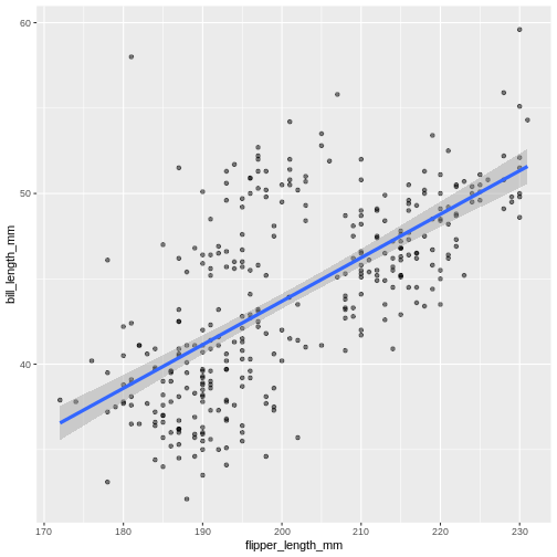
Image 1 of 1: ‘Scatter plot of flipper length vs bill length with a trend line summarising the relationship between variables. The trend line is slightly thicker than in the previous figure.’
Figure 15
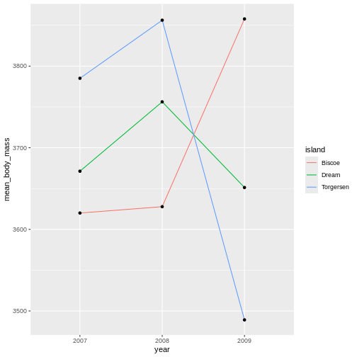
Image 1 of 1: ‘Scatter plot of average body mass (g) over time, showing enlarged orange data points for each year, connected by lines colored by species.’
Figure 16
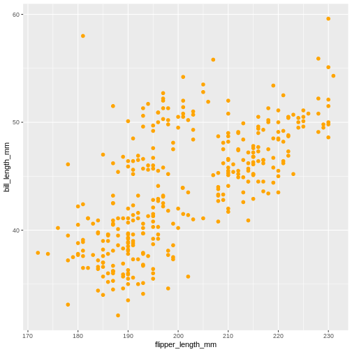
Image 1 of 1: ‘Scatter plot of flipper length (mm) against bill length (mm).’
Figure 17
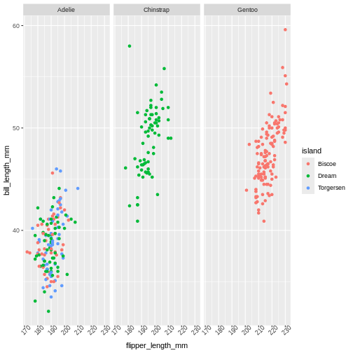
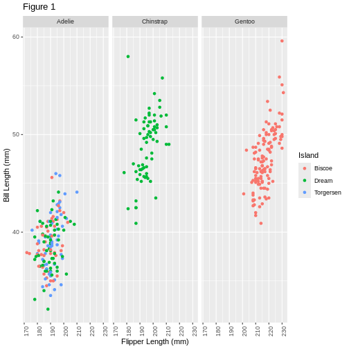
Figure 18
Figure 19
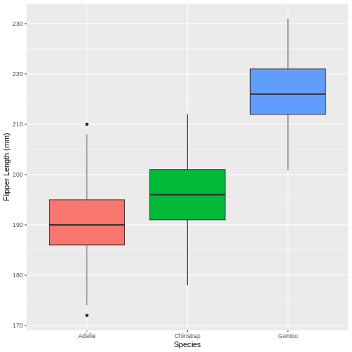
Image 1 of 1: ‘Boxplot comparing flipper length (mm) across penguin species, with labeled axes showing species on the x-axis and flipper length on the y-axis, and the legend hidden for a cleaner view.’