Producing Plots
Overview
Teaching: 20 min
Exercises: 30 minQuestions
How can I produce plots in Python?
Objectives
Plot simple graphs from data.
Visualizing data
The mathematician Richard Hamming once said, “The purpose of computing is insight, not numbers,” and
the best way to develop insight is often to visualize data. Visualization deserves an entire
lecture of its own, but we can explore a few features of Python’s matplotlib library here. While
there is no official plotting library, matplotlib is the de facto the standard. First, we will
import the pyplot module from matplotlib and use two of its functions to create and display a
heat map of our data:
import matplotlib.pyplot
image = matplotlib.pyplot.imshow(data)
matplotlib.pyplot.show()
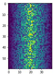
Blue pixels in this heat map represent low values, while yellow pixels represent high values. As we can see, inflammation rises and falls over a 40-day period.
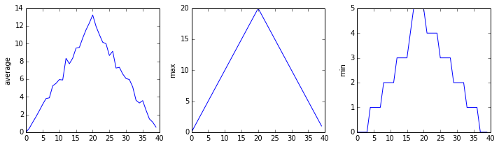
Let’s take a look at the average inflammation over time:
ave_inflammation = numpy.mean(data, axis=0)
ave_plot = matplotlib.pyplot.plot(ave_inflammation)
matplotlib.pyplot.show()
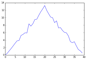
Here, we have put the average per day across all patients in the variable ave_inflammation, then
asked matplotlib.pyplot to create and display a line graph of those values. The result is a
roughly linear rise and fall, which is suspicious: we might instead expect a sharper rise and slower
fall. Let’s have a look at two other statistics:
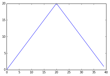
max_plot = matplotlib.pyplot.plot(numpy.max(data, axis=0))
matplotlib.pyplot.show()
min_plot = matplotlib.pyplot.plot(numpy.min(data, axis=0))
matplotlib.pyplot.show()
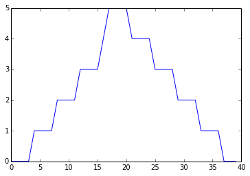
The maximum value rises and falls smoothly, while the minimum seems to be a step function. Neither trend seems particularly likely, so either there’s a mistake in our calculations or something is wrong with our data. This insight would have been difficult to reach by examining the numbers themselves without visualization tools.
Grouping plots
You can group similar plots in a single figure using subplots.
This script below uses a number of new commands. The function matplotlib.pyplot.figure()
creates a space into which we will place all of our plots. The parameter figsize
tells Python how big to make this space. Each subplot is placed into the figure using
its add_subplot method. The add_subplot method takes 3
parameters. The first denotes how many total rows of subplots there are, the second parameter
refers to the total number of subplot columns, and the final parameter denotes which subplot
your variable is referencing (left-to-right, top-to-bottom). Each subplot is stored in a
different variable (axes1, axes2, axes3). Once a subplot is created, the axes can
be titled using the set_xlabel() command (or set_ylabel()).
Here are our three plots side by side:
import numpy
import matplotlib.pyplot

data = numpy.loadtxt(fname='inflammation-01.csv', delimiter=',')

fig = matplotlib.pyplot.figure(figsize=(10.0, 3.0))

axes1 = fig.add_subplot(1, 3, 1)
axes2 = fig.add_subplot(1, 3, 2)
axes3 = fig.add_subplot(1, 3, 3)

axes1.set_ylabel('average')
axes1.plot(numpy.mean(data, axis=0))

axes2.set_ylabel('max')
axes2.plot(numpy.max(data, axis=0))

axes3.set_ylabel('min')
axes3.plot(numpy.min(data, axis=0))

fig.tight_layout()

matplotlib.pyplot.show()
The call to loadtxt reads our data,
and the rest of the program tells the plotting library
how large we want the figure to be,
that we’re creating three subplots,
what to draw for each one,
and that we want a tight layout.
(If we leave out that call to fig.tight_layout(),
the graphs will actually be squeezed together more closely.)
Back to Scripts
When you start producing more complicated plots like this, we recommend switching back to writing scripts so you can store how to make your plots!
Scientists Dislike Typing
We will always use the syntax
import numpyto import NumPy. However, in order to save typing, it is often suggested to make a shortcut like so:import numpy as np. If you ever see Python code online using a NumPy function withnp(for example,np.loadtxt(...)), it’s because they’ve used this shortcut. When working with other people, it is important to agree on a convention of how common libraries are imported.
Plot Scaling
Why do all of our plots go right up to the top of the y axis?
Solution
Because matplotlib normally sets x and y axes limits to the min and max of our data (depending on data range)
If we want to change this, we can use the
set_ylim(min, max)method of each ‘axes’, for example:axes3.set_ylim(0,6)Update your plotting code to automatically set a more appropriate scale. (Hint: you can make use of the
maxandminmethods to help.)Solution
# One method
axes3.set_ylabel('min')
axes3.plot(numpy.min(data, axis=0))
axes3.set_ylim(0,6)
Solution
# A more automated approach
min_data = numpy.min(data, axis=0)
axes3.set_ylabel('min')
axes3.plot(min_data)
axes3.set_ylim(numpy.min(min_data), numpy.max(min_data) * 1.1)
Drawing Straight Lines
In the center and right subplots above, we expect all lines to look like step functions because non-integer value are not realistic for the minimum and maximum values. However, you can see that the lines are not always vertical or horizontal, and in particular the step function in the subplot on the right looks slanted. Why is this?
Solution
Because matplotlib interpolates (draws a straight line) between the points. One way to do avoid this is to use the Matplotlib
drawstyleoption:import numpy import matplotlib.pyplot data = numpy.loadtxt(fname='inflammation-01.csv', delimiter=',') fig = matplotlib.pyplot.figure(figsize=(10.0, 3.0)) axes1 = fig.add_subplot(1, 3, 1) axes2 = fig.add_subplot(1, 3, 2) axes3 = fig.add_subplot(1, 3, 3) axes1.set_ylabel('average') axes1.plot(numpy.mean(data, axis=0), drawstyle='steps-mid') axes2.set_ylabel('max') axes2.plot(numpy.max(data, axis=0), drawstyle='steps-mid') axes3.set_ylabel('min') axes3.plot(numpy.min(data, axis=0), drawstyle='steps-mid') fig.tight_layout() matplotlib.pyplot.show()
Make Your Own Plot
Create a plot showing the standard deviation (
numpy.std) of the inflammation data for each day across all patients.Solution
std_plot = matplotlib.pyplot.plot(numpy.std(data, axis=0))
matplotlib.pyplot.show()
Moving Plots Around
Modify the program to display the three plots on top of one another instead of side by side.
Solution
import numpy
import matplotlib.pyplot

data = numpy.loadtxt(fname='inflammation-01.csv', delimiter=',')

# change figsize (swap width and height)
fig = matplotlib.pyplot.figure(figsize=(3.0, 10.0))

# change add_subplot (swap first two parameters)
axes1 = fig.add_subplot(3, 1, 1)
axes2 = fig.add_subplot(3, 1, 2)
axes3 = fig.add_subplot(3, 1, 3)

axes1.set_ylabel('average')
axes1.plot(numpy.mean(data, axis=0))

axes2.set_ylabel('max')
axes2.plot(numpy.max(data, axis=0))

axes3.set_ylabel('min')
axes3.plot(numpy.min(data, axis=0))

fig.tight_layout()

matplotlib.pyplot.show()
Key Points
Use the
pyplotlibrary frommatplotlibfor creating simple visualizations.